The Power of Colour Psychology in Interiors

How colour choices transform the way your interiors feel

When you step into a room, what’s the first thing you observe? Quite often, it’s the colour. The strange thing is that although the sense you initially use is vision, it’s how a colour makes you feel that’s important. Colour sets the tone and the emotional response. 


I’m not going to get all New Age about this. In fact, I’m going to take you on a little history and science tour.


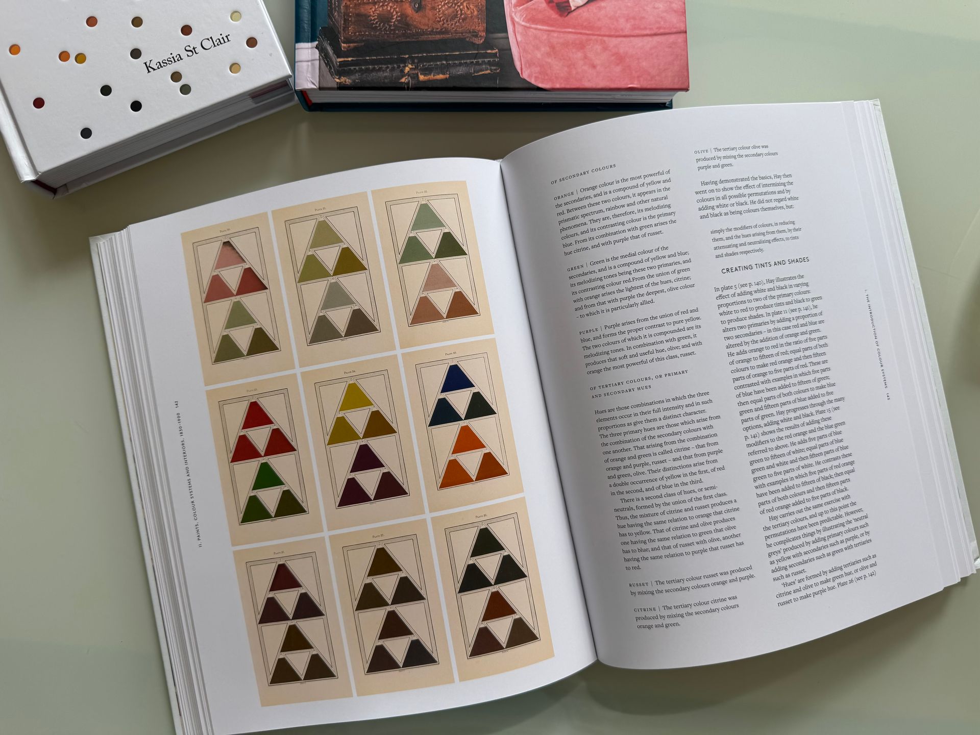
Let’s start with Sir Issac Newton. He understood that without light colour wouldn’t exist. In the 1660s, he demonstrated that while light might look white, it is in fact made up of a spectrum of seven colours. Shine sunlight through a prism and a rainbow appears, splitting light into its component parts. 

Let’s jump forward a century, and the second person I want to introduce you to is Johann Wolfgang von Goethe, born in Frankfurt in 1749. His theory was that colour is subjective. People see different things based on their culture, emotions and personal experiences. He categorised colours into warm and cool tones, placing them deliberately on opposing sides of his colour wheel.


He studied their emotional and symbolic resonance. According to Goethe, yellow symbolises warmth and joy, blue conveys calmness (but can also feel cold or melancholic), orange sparks creativity and enthusiasm, while violet evokes mystery and luxury.


Why Colour Psychology Matters in Interiors

Homes are more than just walls and furniture. They are emotional canvases. The colours we choose shape mood, behaviour and even relationships. However, what feels invigorating to one person may be overwhelming to another. No sure where to start, here’s a basic run down of how and where to use colours:


  • Energy and sociability: Reds and oranges invigorate, perfect for dining rooms or creative zones.
  • Calm and repose: Blues, greens, muted earth tones foster serenity, ideal for bedrooms and bathrooms.
  • Warmth and connection: Yellows, terracottas and cosy neutrals embrace you, great for living areas.
  • Depth and elegance: Deep hues like navy or forest green offer sophistication and calm.


Facing Chromophobia: Embracing Colour

When selecting colours for our homes many of us retreat to safe neutrals. It’s not, necessarily, out of preference, but from an unconscious fear of colour. But to feel truly at home in your space, it’s worth exploring. Here’s how to start:


  • Begin with function and emotion: Consider how a room should feel. For rest, go cool; for creativity and connection, lean warm.
  • Use tone and symbolism with care: Warm tones like orange (creative, lively) or yellow (joyful) might suit a breakfast nook, while deep green or violet (mystical, introspective) may elevate a study.
  • Layer, don’t overwhelm: Not ready to paint every wall? Introduce accents, such as a lamp, rug or artwork to test how a colour affects mood before fully committing.
  • Be sensitive to light: Goethe noted the interplay between light and darkness shapes colour perception. A hue may feel chilly in low light, or brilliant when illuminated. And if you think white is the answer to lighten a dark room, you’ll only succeed in introducing a dull grey.
  • Make it personal: Psychology gives us a guide, but your gut response matters most. If a shade moves you, it belongs in your home.
  • Create a flow: You don’t need to introduce a different colour for each room. You want to create a palette that means rooms are connected and colours can flow from room to room.


Putting Theory into Practice

  • Visual relationships: Goethe’s colour wheel arranges warm and cool hues opposite each other, with complementary pairs “demanding” one another: yellow with violet, orange with blue. This suggests powerful visual and emotional interplay and can be liberating. A splash of orange in a blue room creates energy, while violet paired with yellow ignites luxurious contrast.


  • Symbolic depth: Goethe tied colours to qualities: red as the “beautiful”, orange “noble”, yellow “good”, green “useful”, blue “common”, violet “unnecessary”, inviting a more poetic and psychological approach to design. Imagine painting a creative studio in “noble” orange or a reading nook in “restful” blue. You’ve now moved your interiors on from aesthetics towards a narrative.


Final Thoughts

Colour psychology reminds us that interiors are emotional as much as visual. Whether you’re inspired by historic palettes or Goethe’s symbolic wheel, colour carries power. Let it softly or boldly shift how your spaces make you, and others, feel. This is what turns a house into a home and a soulless office into a creative space. Colour is so much more than making something “look good”!


If you’d like to learn more about colour psychology, I’d recommend reading Patrick Baty’s beautiful book The Anatomy of Colour, which traces the historical and emotional significance of pigments, showing that colour is never just decoration but deeply affects how a space feels.


I also love Anna Starmer’s Love Colour book, Hans Blomquist’s book In the Mood for Colour, and The Secret Lives of Colour by Kassia St Clair.


  • Slide title

    Write your caption here
    Button
  • Slide title

    Write your caption here
    Button
  • Slide title

    Write your caption here
    Button
  • Slide title

    Write your caption here
    Button
  • Slide title

    Write your caption here
    Button
  • Slide title

    Write your caption here
    Button
  • Slide title

    Write your caption here
    Button
  • Slide title

    Write your caption here
    Button
  • Slide title

    Write your caption here
    Button
By Helen McClure February 2, 2026
Why Understanding Heritage Properties Helps Shape Better Interiors
Marie Antoinette surrounded herself with Toile de Jouy fabric
By Helen McClure January 21, 2026
A visit to the Marie Antionette Style exhibition at the Victoria and Albert Museum in London shows that fashion and interiors are not separate worlds
By Helen McClure December 16, 2025
History at Home a research service, which investigates the history of your house and its setting. It informs your interior design and architectural decisions.
Rear view of Norney Grange
By Helen McClure December 16, 2025
Norney Grange, near Godalming in Surrey, demonstrates simple beauty, stunning craftsmanship and a comfortable environment, which is easy to live and work in.
Picture of History at Home research
By Helen McClure December 9, 2025
Here's how historical research into your home can help create interiors with a real connection.
By Helen McClure November 20, 2025
Create a cosy, sustainable Christmas with natural decorations and colour psychology. Discover ideas for foraging, crafting and styling your festive home beautifully.
By Helen McClure November 6, 2025
Marrying Arts and Crafts design with Art Deco glamour
Castle Drogo in Devon. The last castle built in England
By Helen McClure November 3, 2025
How do heritage homes help modern interior designers? This article looks at Castle Drogo in Devon, designed by Edwin Lutyens.
By Helen McClure October 23, 2025
The Russell-Cotes Museum - the ultimate gift
By Helen McClure September 29, 2025
Craft, Advocacy & Legacy