Using a Neutral Palette in Heritage Interiors

A Little Bit of Calm

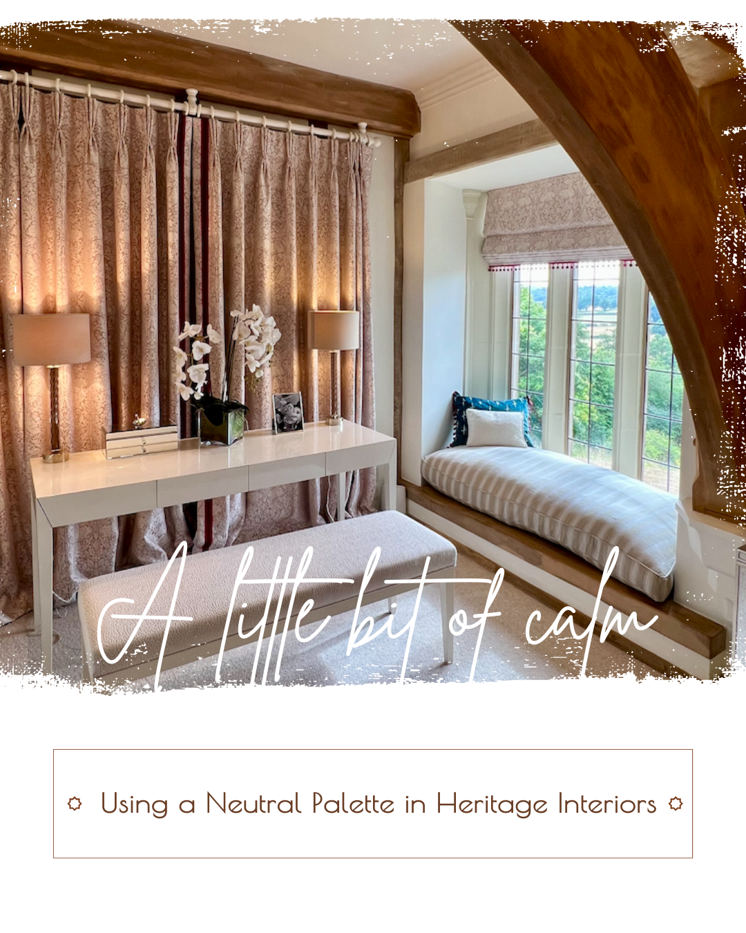
Neutral palettes have long been a staple in period properties, offering an elegant backdrop that enhances the architectural charm of heritage interiors. Far from being bland or uninspired, a well-curated neutral scheme can highlight original features, create a timeless aesthetic and provide the perfect foundation for layering textures and accents. Here’s how to make the most of neutrals in your period home. 


One of the greatest strengths of neutral tones is their ability to draw attention to the craftsmanship of a period property. Soft greys, warm creams and muted stone shades can subtly frame intricate woodwork, decorative mouldings or an ornate fireplace, allowing these features to take centre stage. A chalky off-white can make ceiling cornices pop, while a deep taupe against panelled walls brings out the richness of the wood grain. By carefully selecting neutral shades that complement rather than compete, you enhance the authenticity of your home’s character.

Layering for Depth and Warmth

The key to using neutrals successfully is layering. Without depth, neutral schemes can feel flat or cold, but the right mix of textures and tones brings warmth and interest. Try pairing matte-painted walls with glossy woodwork for contrast, or mix different materials such as linen, wool, and aged oak to add visual weight. A limestone-toned wall with a velvet-upholstered chair and a woven rug instantly creates a sense of richness and dimension.


Introducing Accent Colours & Patterns

A neutral scheme doesn’t mean avoiding colour altogether. Soft accent shades—such as dusky blues, sage greens or even a muted blush—can add depth while maintaining the heritage feel. Consider using these hues for upholstery, decorative accessories or even within a classic wallpaper pattern to introduce subtle interest. Vintage-inspired patterns, whether through textiles or artwork, can further enrich a neutral scheme while staying true to the home’s historic charm.


Perfect Neutral Combinations for Period Homes

Selecting the right neutrals for a heritage property means balancing warmth, depth and authenticity. Beige doesn’t have to mean boring. Some of our favourite combinations include:


  • Greige & Chalk White – Ideal for panelled rooms, offering a sophisticated yet soothing effect.
  • Stone & Dusty Blue – A classic combination that works beautifully in Georgian and Edwardian properties.
  • Warm Taupe & Aged Oak – Perfect for enhancing the natural beauty of wooden floors and antique furniture.


Create Your Own Timeless Neutral Scheme

If you're looking to embrace the magic of neutrals in your period home but need guidance in selecting the perfect palette, we’re here to help. At Home by Design offers expert colour consultations tailored to heritage properties, ensuring your interiors remain timeless, elegant and full of character. Why not start with a consultation to get some ideas?

Make an enquiry
By Helen McClure April 22, 2025
How to Renovate Heritage Homes Sustainably
Arts and Crafts doorway
By Helen McClure March 31, 2025
How to renovate a period property by striking the perfect balance between tradition and modernity.
Living room interior with film set lighting
By Helen McClure March 18, 2025
What's your interiors story?
By Helen McClure February 17, 2025
Getting the Best Out of a Relationship with an Interior Designer
Mosque interior
By Helen McClure February 5, 2025
Interiors Inspired by Travel
Renovation help - handy renovation checklist to get you started
By Helen McClure January 27, 2025
Handy home renovation checklist to get you started
Colour bathroom with grey concrete and peacock coloured mosaic tiles
By Helen McClure January 20, 2025
Bathrooms Through the Ages:  A Journey of Design and Innovation
By Helen McClure January 6, 2025
Transforming your home and your mood
By Helen McClure December 17, 2024
Embracing Cosy Interiors with Seasonal Colour Psychology
By Helen McClure December 2, 2024
Choosing the perfect curtains in six steps
More Posts