Why Most People Choose the Wrong Colours
Start With How You Want the Room to Feel
Before thinking about paint charts or trends, pause and ask a simpler question.
How do you want this room to feel when you walk into it?
- Calm and restorative?
- Warm and welcoming?
- Light and uplifting?
- Rich and cocooning?
This is where colour psychology comes in, and it is often the missing piece.
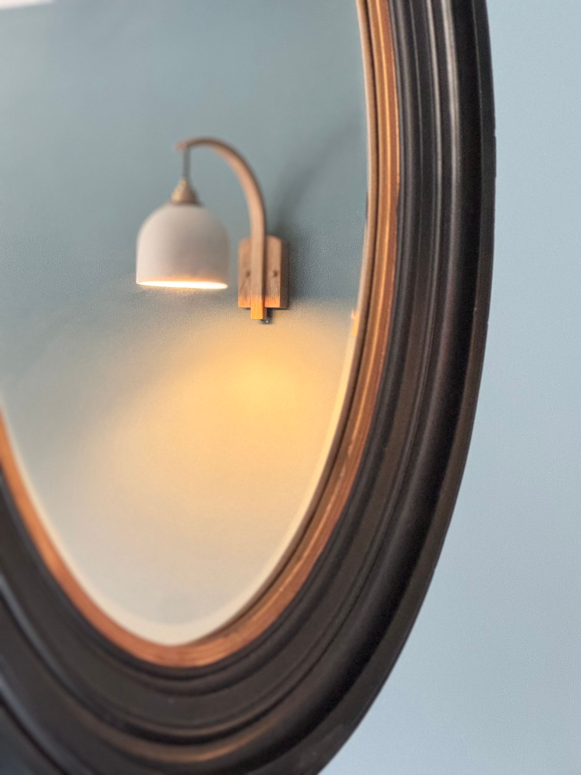
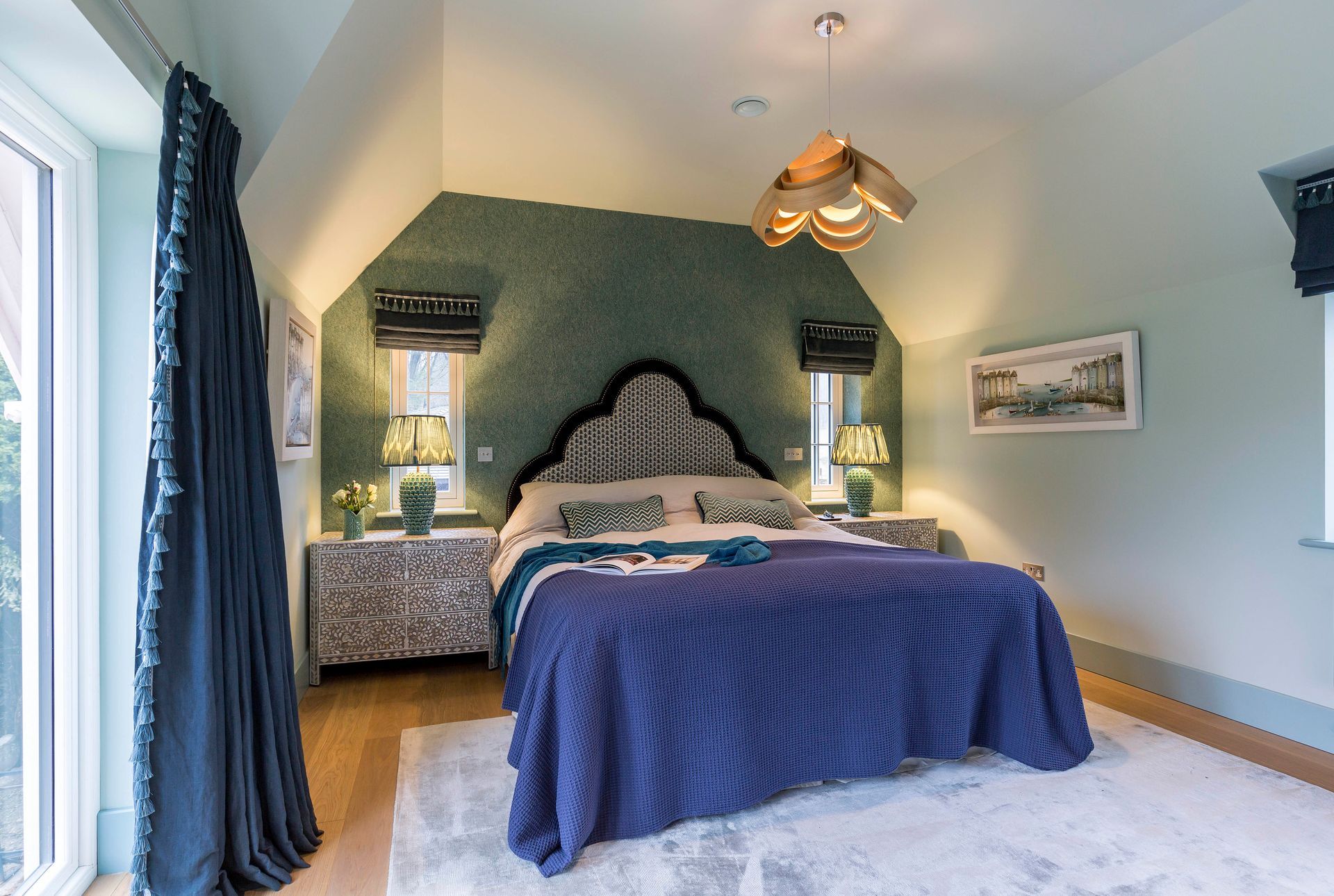
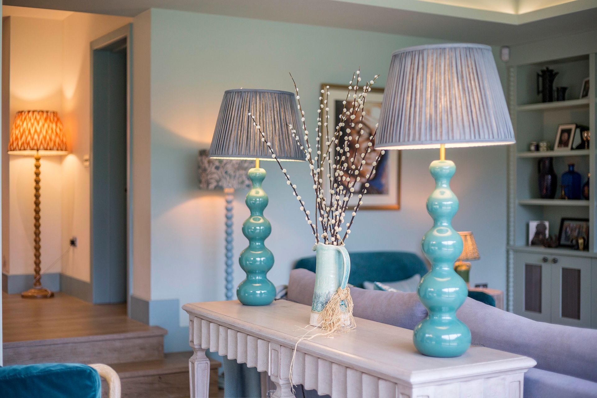
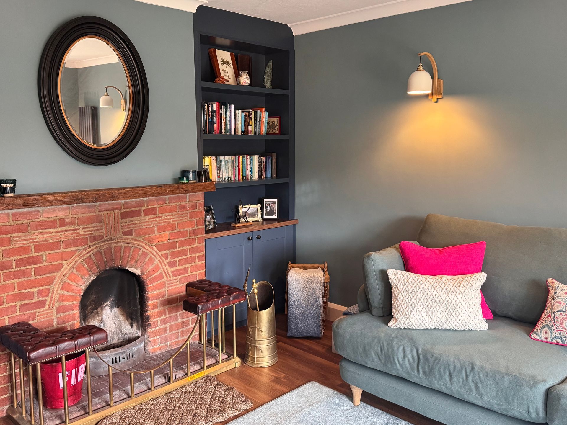
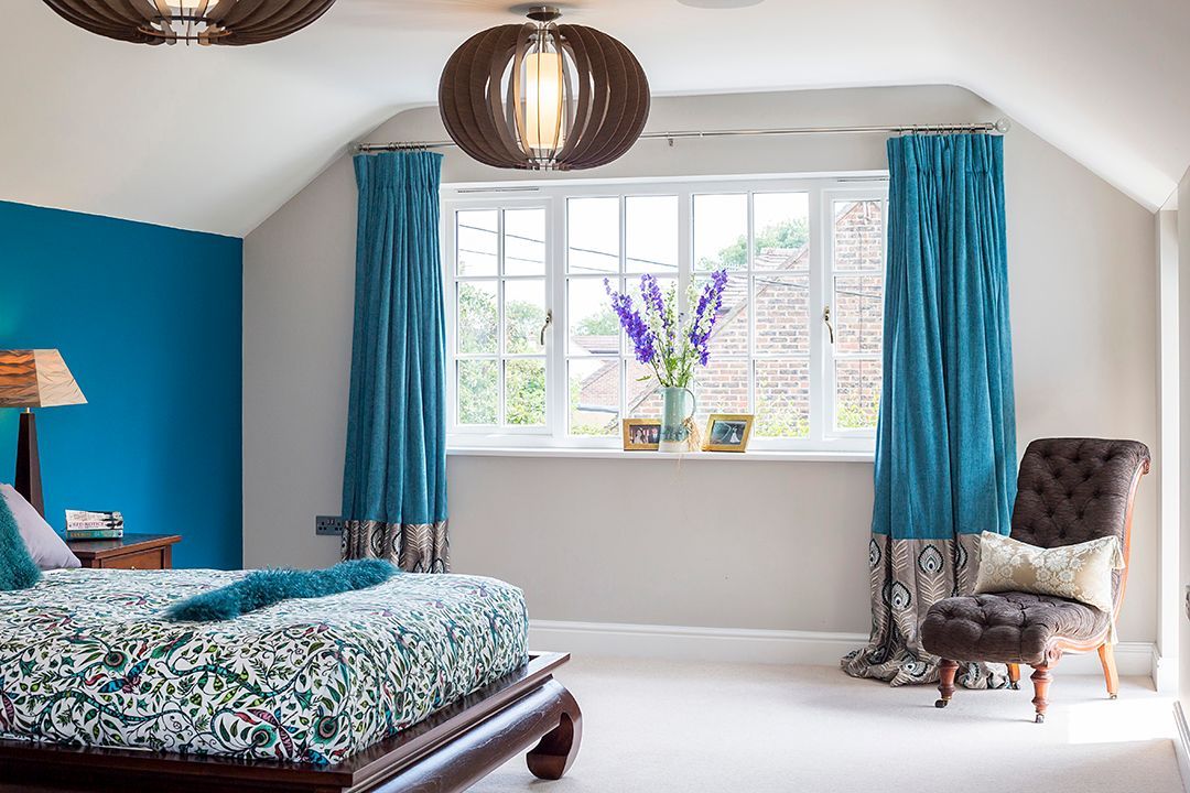
Soft greens and blues tend to create a sense of calm. Earthy tones feel grounding and comforting. Deeper shades can make a space feel intimate and secure.
When you begin with feeling rather than colour names, your choices become much clearer.
Understand the Role of Light
One of the biggest mistakes I see is choosing a colour in isolation.
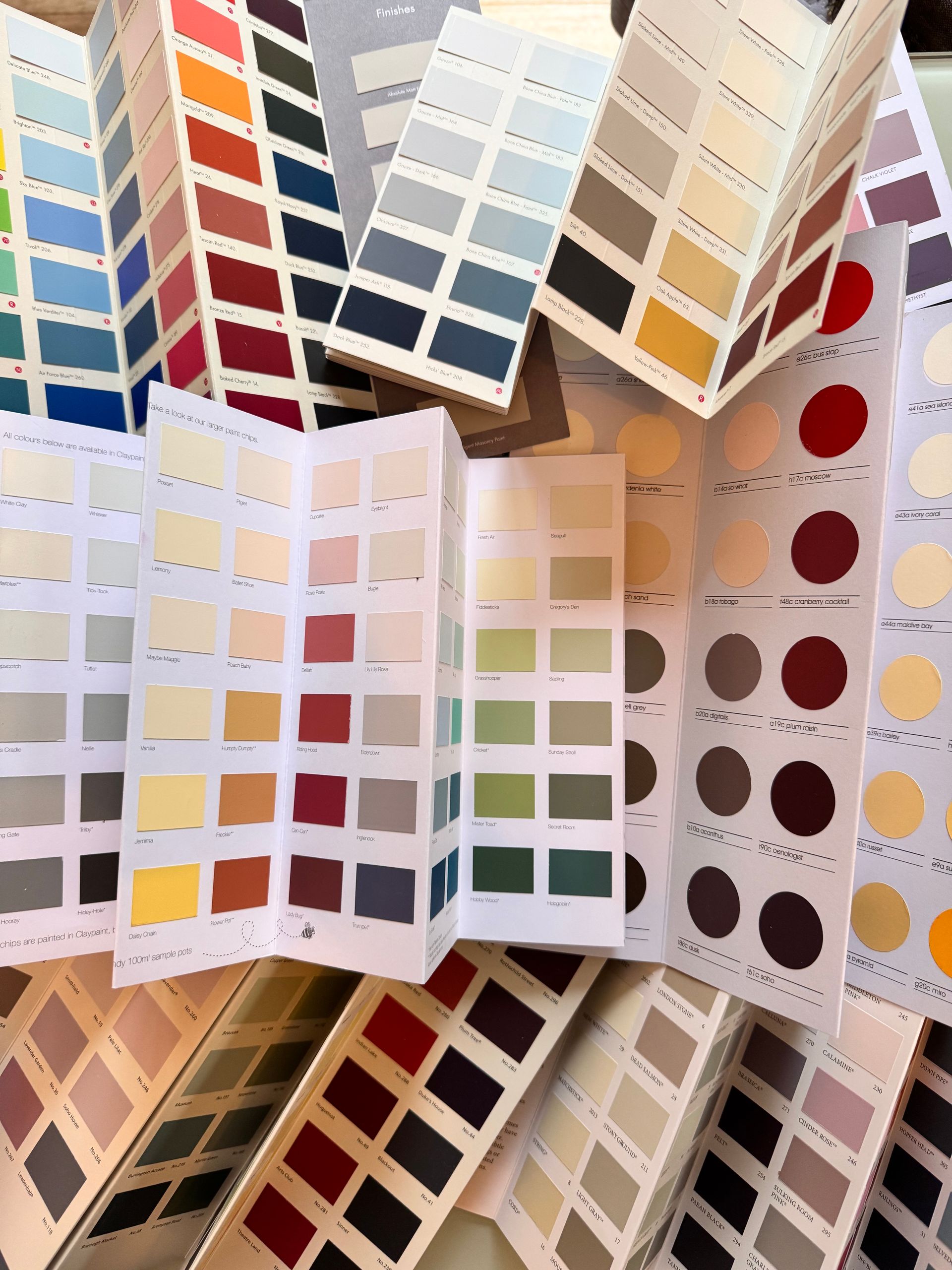
A paint sample in a shop or on a screen tells you very little about how it will behave in your home.
Natural light shifts throughout the day. North-facing rooms can flatten colours, while south-facing rooms can intensify them. Artificial lighting adds another layer again.
A soft neutral in one room can look cold in another. A gentle green can suddenly appear much stronger once it is on all four walls.
This is why testing in situ is not optional. It is essential.
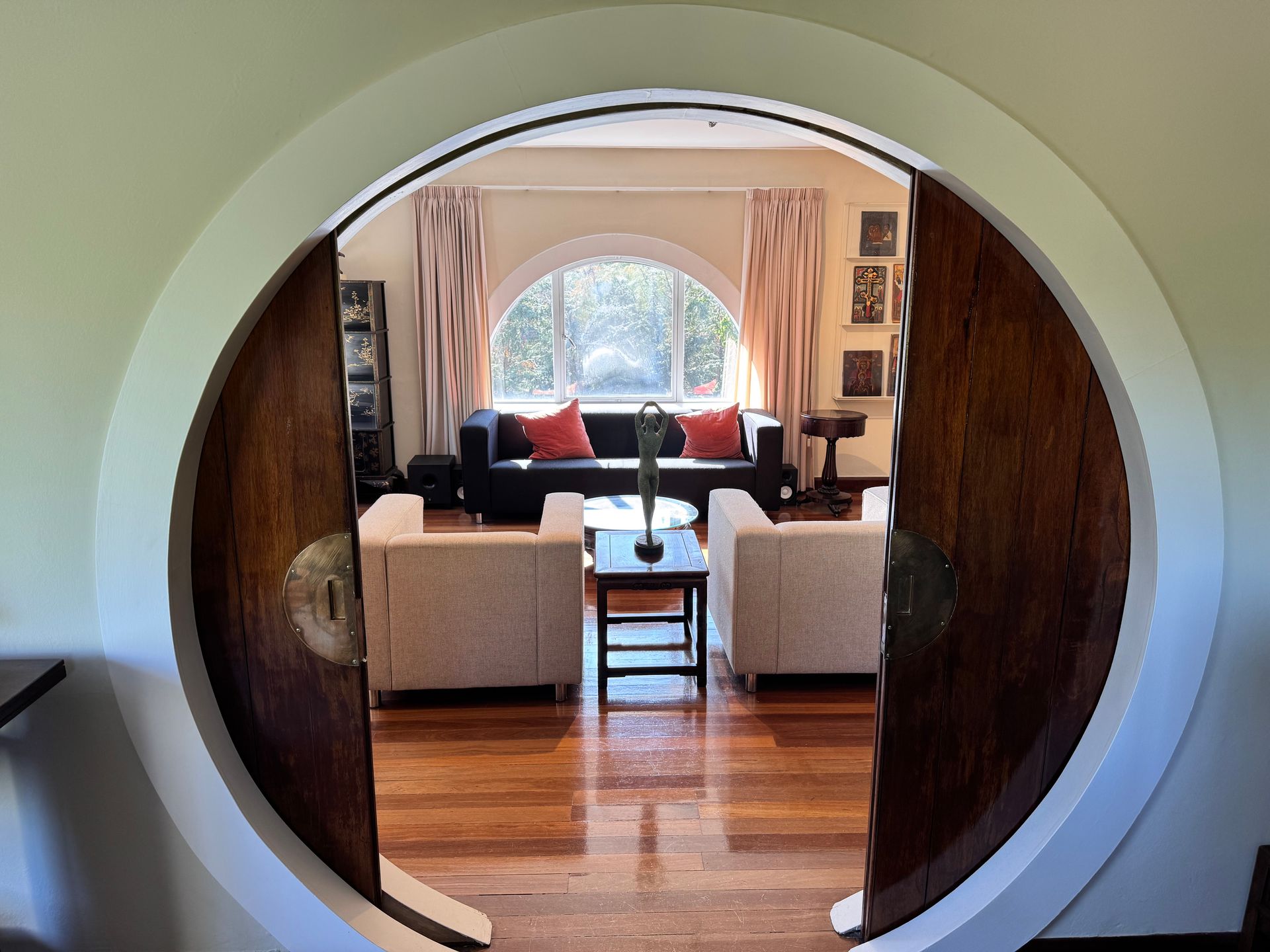
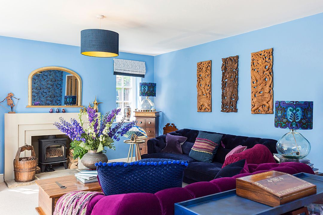
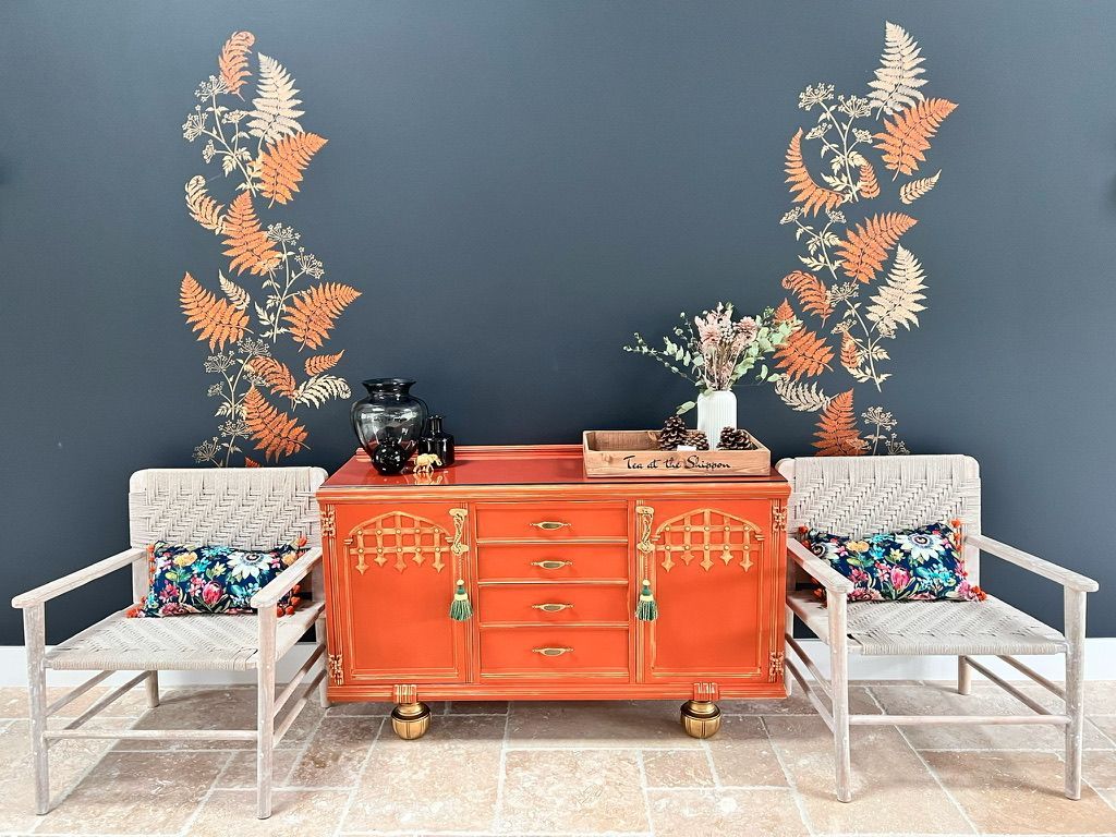
Think in Palettes, Not Single Colours
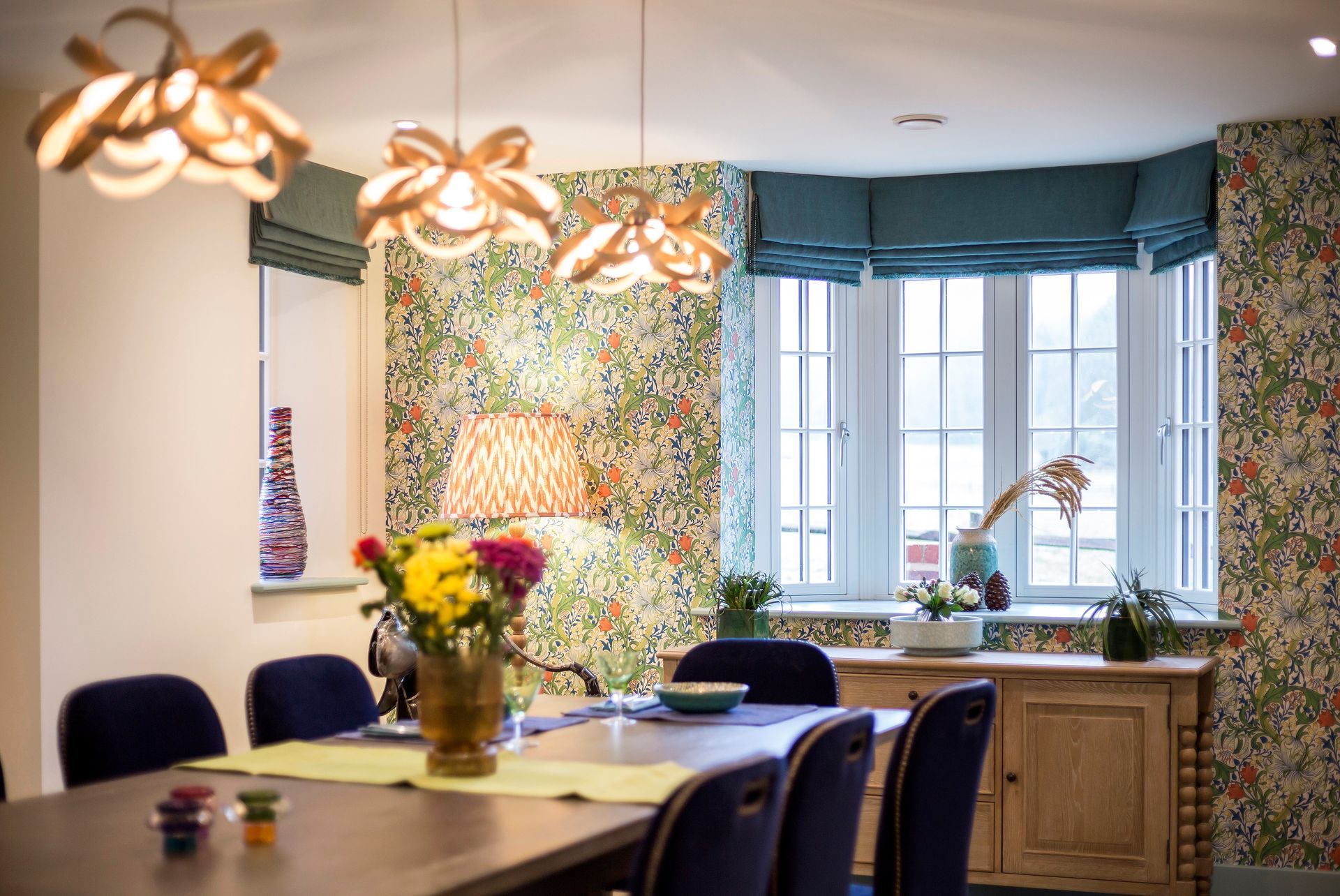
Homes that feel cohesive are rarely built around one colour. They are built around a palette.
This does not mean everything has to match. Colour drenching is a trend, but it may not be right for your rooms. What you need for long-lasting impact are the right shades and palette for your home. The most interesting interiors use a considered mix of tones that relate to each other.
You might start with a base of soft neutrals, layer in mid tones, then add depth with darker accents. Or you might take inspiration from nature, where colours naturally sit comfortably together.
The key is restraint. Too many competing colours and the space starts to feel unsettled. That doesn’t mean the room can’t look lively and vivacious. It just means less is more.
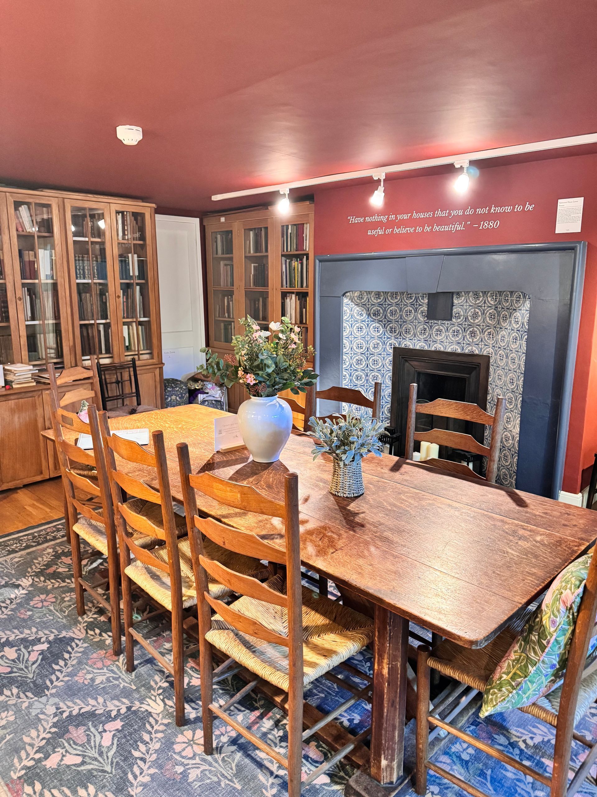
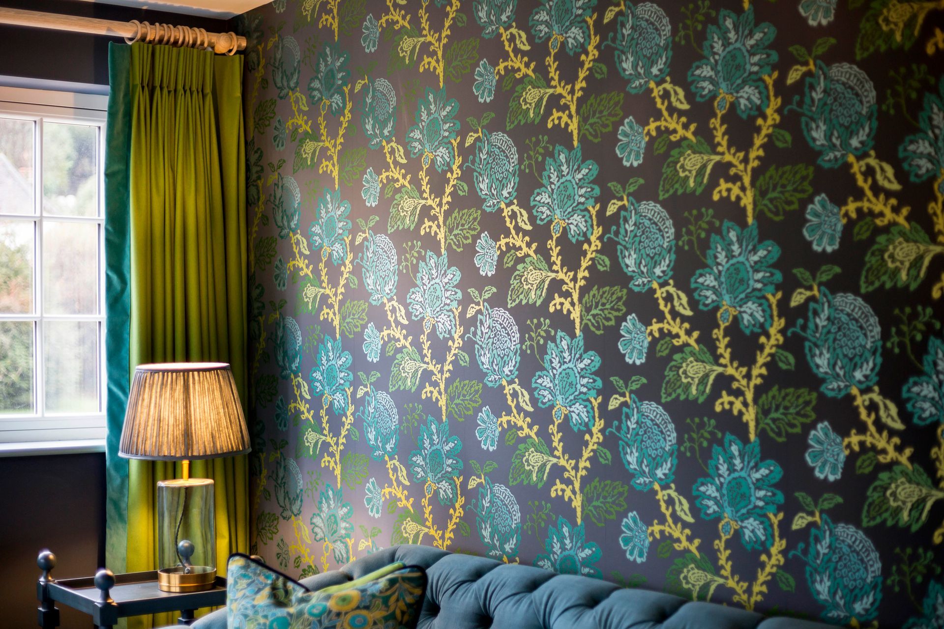
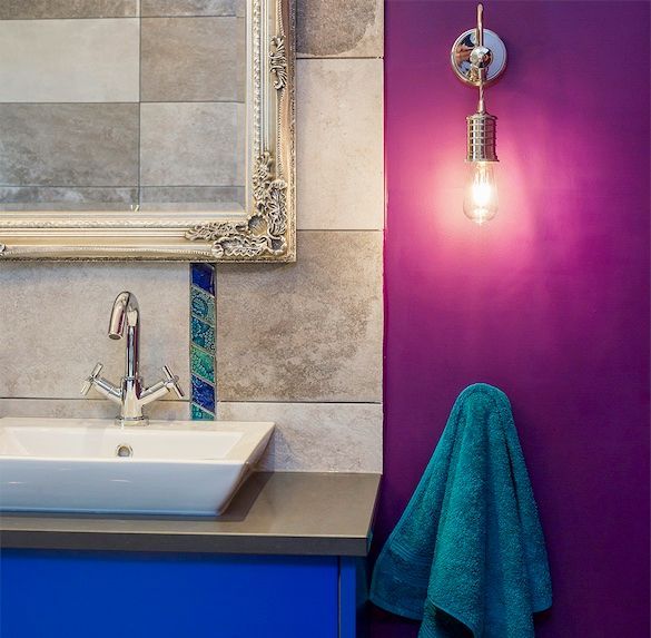
Use Colour Beyond the Walls
If committing to colour feels daunting, start elsewhere. Cushions are probably the least expensive place to start if you’re trying to work out if you can live with a colour. Bespoke interiors, however, consider how colours play and interact across upholstery, curtains, artwork, rugs, joinery and accessories.
These elements allow you to introduce colour in a more flexible way. They also add texture and depth, which is just as important as the colour itself.
Often, once these layers are in place, the right wall colour becomes obvious.
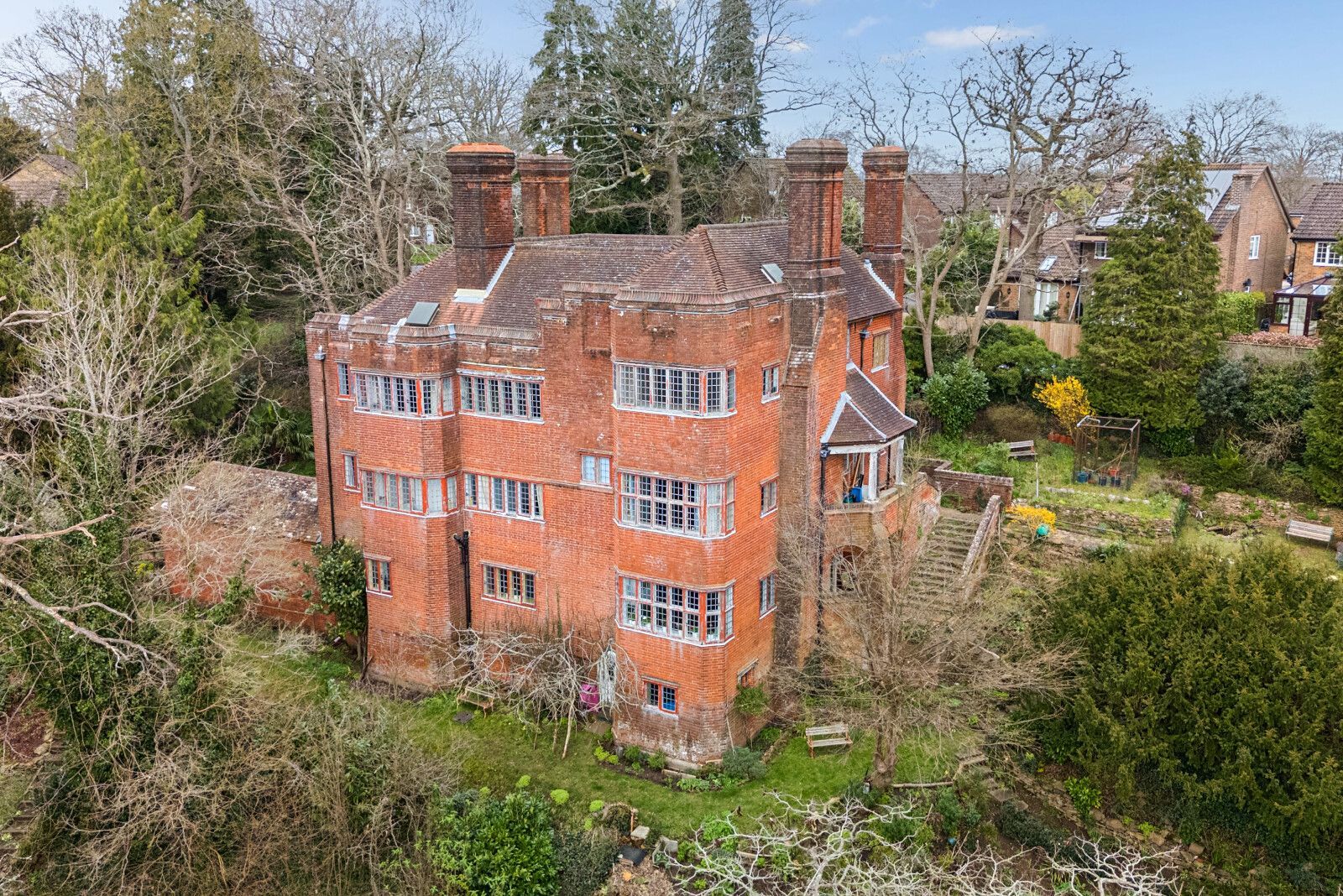
Respect the Architecture of Your Home
In period properties, colour should never feel imposed. It should feel as though it belongs.
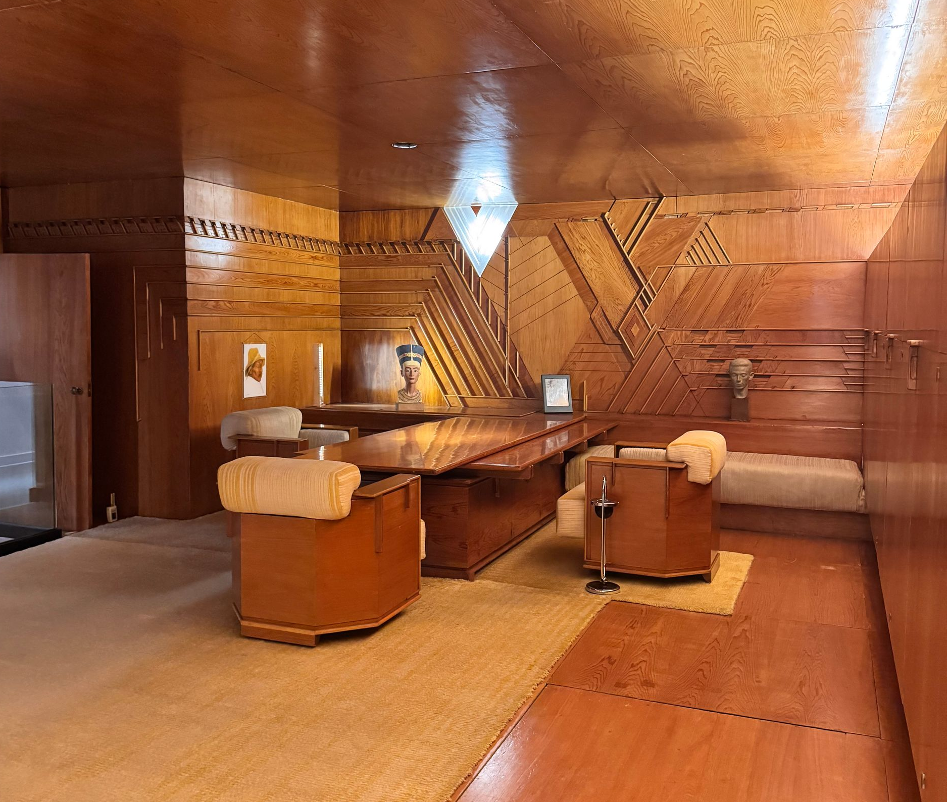
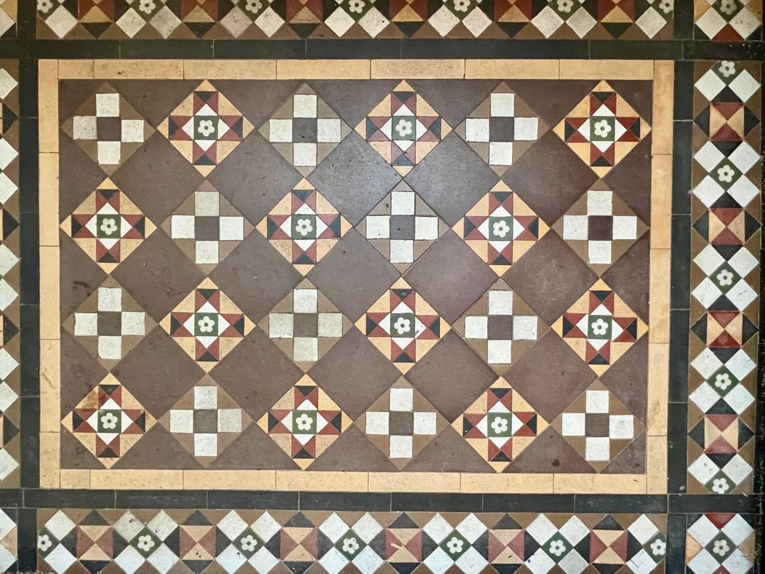
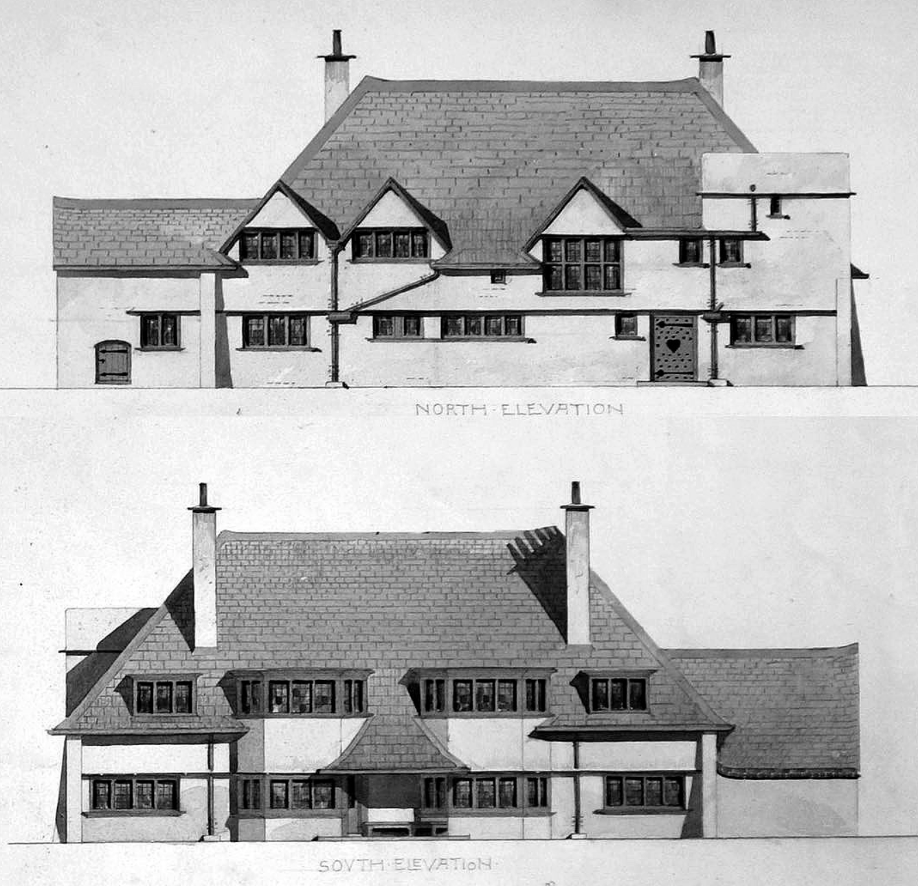
That might mean drawing from the age of the building, its materials, or even its setting. A Victorian home can carry deeper, richer tones beautifully. An Arts and Crafts house often suits softer, nature-inspired palettes.
When colour works in harmony with the architecture, the result feels effortless, and you may end up choosing something you would never have initially been drawn to on a paint chart.
The Quiet Secret to Getting it Right
There is no perfect colour in isolation. There is only the right colour for that room, in that light, for the way you live.
The homes that feel the most successful are not the ones that follow trends. They are the ones where colour has been considered, tested and layered. Colours with intention.
Slide title
Write your caption here
Button
Slide title
Write your caption here
Button
Slide title
Write your caption here
Button
Slide title
Write your caption here
Button
Slide title
Write your caption here
Button
Slide title
Write your caption here
Button
Slide title
Write your caption here
Button
Slide title
Write your caption here
Button
Slide title
Write your caption here
Button
Need a Hand?
If you are unsure where to start, this is exactly where a professional eye can make all the difference.
At Home by Design, I help clients create considered colour palettes that feel personal, balanced and entirely at ease within their homes.
If you would like help shaping your space, I would love to hear from you.